PrivacyGuard
Case Study: PrivacyGuard is a live mobile application (iOS and Android) used for credit monitoring and identity protection. I led UX improvements implemented in the product.
Privacy Guard App
View the live application
IOS Google Play Store
Role: Lead UX/UI Designer
Client: Tenerity Limited
Product: PrivacyGuard (iOS, Android)
Focus: Credit Monitoring, Data Protection, Financial Security

The Challenge: A Valuable Tool Undermined by Poor Usability
When I joined the PrivacyGuard project at Tenerity, the app already offered a powerful core feature: a centralized place for users to monitor their credit activity across all three major bureaus, as well as tools to protect their personal and financial data.
However, despite its value, the experience was clunky, visually outdated, and difficult to navigate — especially on mobile devices. Users had the tools, but they struggled to find and understand them. Feedback and behavior made it clear: the design wasn’t meeting users where they were.


My Approach
Elevating Usability and Visual Clarity
As the Lead UX/UI Designer, I led a comprehensive redesign of the PrivacyGuard platform, collaborating with product, engineering, and research teams to transform the experience into one that is intuitive, modern, and user-centered.
A significant addition I helped concept and design was the Newsroom — a curated section featuring articles, tips, and blogs around credit protection, budgeting, identity theft, and digital safety. This created an opportunity for PrivacyGuard to build an ongoing relationship with users, rather than just monitoring data.
Research & Findings:
-
User testing revealed confusion around enrollment steps and credit score visibility within the existing app experience
-
Users wanted faster access to monitoring tools, alerts, and identity protection features from the dashboard
-
Feedback sessions highlighted the need for a more modern and trustworthy mobile experience across key workflows
Key objectives included:
-
Streamlining the enrollment flow to reduce drop-off and increase completion
-
Redesigning the interface for clarity, hierarchy, and a polished visual aesthetic
-
Introducing meaningful, relevant content to support and retain users


Design Process
My goal was to turn PrivacyGuard into a more intuitive, trustworthy, and visually appealing experience while maintaining its robust credit monitoring and data protection functionality. This required a user-centered design process, starting from foundational research all the way through high-fidelity design.
(01) UX Workshops & Research
We kicked off the redesign with cross-functional UX workshops that brought together product owners, developers, and customer support to align on user pain points and business goals. From there, I facilitated exercises like empathy mapping and journey modeling to uncover friction points in the original experience. It became clear that while users valued having all three credit bureaus in one place, they often struggled to navigate or understand the interface.
(02) User Interviews & Insights
To validate our hypotheses, I conducted 1:1 interviews with current and potential users. These sessions revealed that people felt overwhelmed during the enrollment process and uncertain about how to interpret their credit information. We also discovered a desire for education—users wanted more context around credit monitoring, identity theft, and financial wellness. This insight led directly to the idea for a dedicated “Newsroom” feature.
(03) Sketching & Wireframes
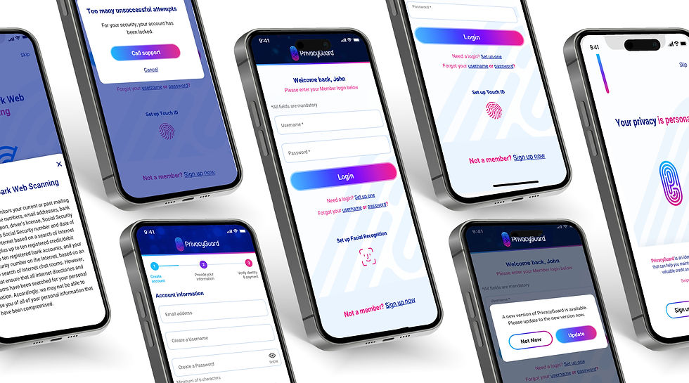
I sketched multiple iterations of both the enrollment flow and the proposed Newsroom content hub. Using mid-fidelity wireframes, we tested layout concepts that prioritized clarity, reassurance, and simplicity. I paid special attention to visual hierarchy and content pacing to reduce cognitive load, especially in the multi-step onboarding. I also included guided tooltips and progress indicators to improve completion rates.
(04) Enrollment Redesign & Newsroom UX
The redesigned enrollment flow used a modular card system that guided users step by step with contextual help. I introduced a modern, mobile-first design that focused on clear typography, intuitive interactions, and brand-consistent visuals. For the Newsroom, I structured the content using a card-based layout with filters by topic (e.g., credit protection, budgeting, scams). We incorporated calls to action within articles to reinforce the value of monitoring and keep users engaged beyond their core financial tracking.

Design System
Created a reusable component system for PrivacyGuard that improved design consistency and streamlined collaboration between design and development.
PrivacyGuard Design System

 Onboarding Process Flow |  Newsroom Process Flow | 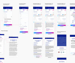 Onboarding Process Flow |
|---|---|---|
 Onboarding Process Flow |  Onboarding A/B Test |  A/B Test |

The Results: More Engagement, Higher Trust
The redesign led to significant improvements in both usage metrics and user sentiment:
-
80% of both new and existing users increased their time spent in the app post-launch
-
Enrollment completion rose due to the simplified and guided onboarding experience
-
The Newsroom became one of the most visited sections, encouraging repeat engagement
-
These improvements were implemented in the live application and informed by post-launch usage and testing.
Feedback from real users highlighted the success of the redesign: -
“It’s just easier to navigate now… I actually want to open the app more often.”
— User from post-launch interview -
“The Newsroom feature is really cool—keeps me in the loop without having to
search the internet.”
— User from usability testing
These comments confirmed that the improved experience didn’t just
look better — it worked better.
Reflection: Designing for
Clarity and Confidence
This project reminded me that even feature-rich products can fail to connect if the experience isn’t accessible or inviting. By addressing usability, visual hierarchy, and content value, we helped transform PrivacyGuard into a tool that users not only trusted but also genuinely wanted to engage with.
As the Lead UX/UI Designer, I’m proud of how this work combined visual design, thoughtful interaction, and meaningful content to improve people’s financial security and digital awareness.


