Apentech University
Case Study: Aspentech University is a live SaaS training platform used for enterprise certification and learning. I led UX improvements implemented in the product to improve course discovery, certification completion, and overall engagement.
View the live website
Role: Principal UX/UI Designer
Agency: Apps Associates
Client: Aspentech (Academic Program: Aspentech University)
Platform: Mobile-first responsive web and Desktop (Salesforce/SaaS integration)

Overview
Aspentech, a global leader in industrial software, had launched Aspentech University. This academic certification platform offers students and professionals specialized technical training for high-level roles in the tech and industrial sectors. When I joined the project as Principal UX/UI Designer through Apps Associates, my goal was clear: transform a cluttered, confusing user experience into one that was visually engaging, structured, and intuitive — ultimately increasing course engagement, purchases, and retention.
The Problem
The original platform created confusion at nearly every point of contact. Course offerings were presented as a long, unstructured list with no categorization or visual hierarchy. New users had no guidance on where to start or what courses aligned with specific certification paths. The homepage lacked a clear structure or value proposition, and mobile usability was inconsistent. These issues led to high bounce rates and a low sense of trust and confidence in the product.


My Role
As the Principal UX/UI Designer, I led the entire redesign effort from user research and wireframes to high-fidelity UI and developer handoff. Working closely with cross-functional teams in a Scrum-based Agile process, I collaborated across product, marketing, engineering, and Salesforce specialists to deliver a best-in-class learning and certification platform.
Research & Findings:
-
User feedback highlighted challenges with course discovery, certification tracking, and overall navigation within the training platform
-
Existing workflows created friction for users attempting to locate learning paths and complete certifications efficiently
-
Stakeholder discussions emphasized the need for a more scalable and user-friendly SaaS learning experience


Design Process
(01) Research & Strategy
We began by conducting stakeholder interviews, competitor analysis, and reviews of behavioral data to identify drop-off points and user pain points. I led discovery sessions to map the customer journey and user personas, focusing on prospective students navigating technical training programs for career advancement.
(02) Structuring the Experience
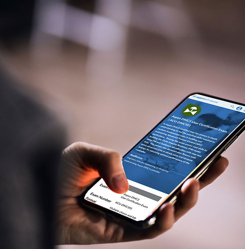
The key challenge was to create clarity and maintain a smooth flow. I redesigned the homepage to reflect better user expectations — with a structured hero area, program highlights, and visual course pathways. I created individual landing pages for each certification track, giving users clear information on program structure, learning goals, and course prerequisites.
(03) Navigation Redesign
The most transformative design decision was reimagining the site’s navigation. I designed a complex mega-dropdown navigation system that broke courses down by discipline, level, and certification track, enabling users to easily self-select paths. The new nav system was both visually appealing and highly functional, and post-launch user testing confirmed that it was one of the most celebrated changes across the entire redesign.
(04) Visual Design & Accessibility
Through the thoughtful application of color theory, typography, and visual hierarchy, I created a clean and engaging UI that strikes a balance between credibility and energy. I optimized layouts for mobile responsiveness and tested key flows across breakpoints. The final design made it just as easy to browse and buy courses on mobile as on desktop — a significant improvement.

Design System
Established shared UI patterns and reusable components for Aspentech University to support scalable workflows and a more consistent user experience.
Aspentech University Design System

 Low-Fidelity Wireframes |  Mobile Process Flow |  Desktop Process Flow |
|---|---|---|
 Dataroom Mobile Flow |  Desktop Navigation | 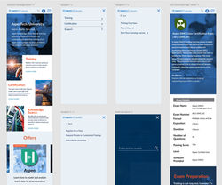 Mobile Navigation |
 Exam Information Page |  Certification Homepage |

Results
• High usability test scores, especially around navigation and homepage clarity
• Significantly increased user engagement and course exploration
• Positive mobile feedback from users who could now browse and purchase courses easily
• Aspentech's main corporate website adopted the redesigned navigation, following the success of the university site
User Feedback
“This is so much easier to understand. I finally know where to start.”
“I can’t wait for you to launch this — and it’s not even finished yet.”
“It actually feels fun to explore courses now. Love how it looks and flows.”
“Being able to browse and buy on my phone is huge. This wasn’t possible before.”

Reflection
This project was significant for me, not only because of the impact it had on Aspentech’s users, but because it was my first complete project using an Agile/Scrum methodology. Working in sprints allowed me to iterate quickly, gather fast feedback, and keep the cross-functional team in sync from concept to launch.
The success of the redesigned navigation system — eventually adopted across Aspentech’s broader digital ecosystem — reminded me of the foundational importance of good information architecture and intuitive design. Visual polish matters, but when paired with strategic clarity and a user-first mindset, design can truly change how people feel and behave.


